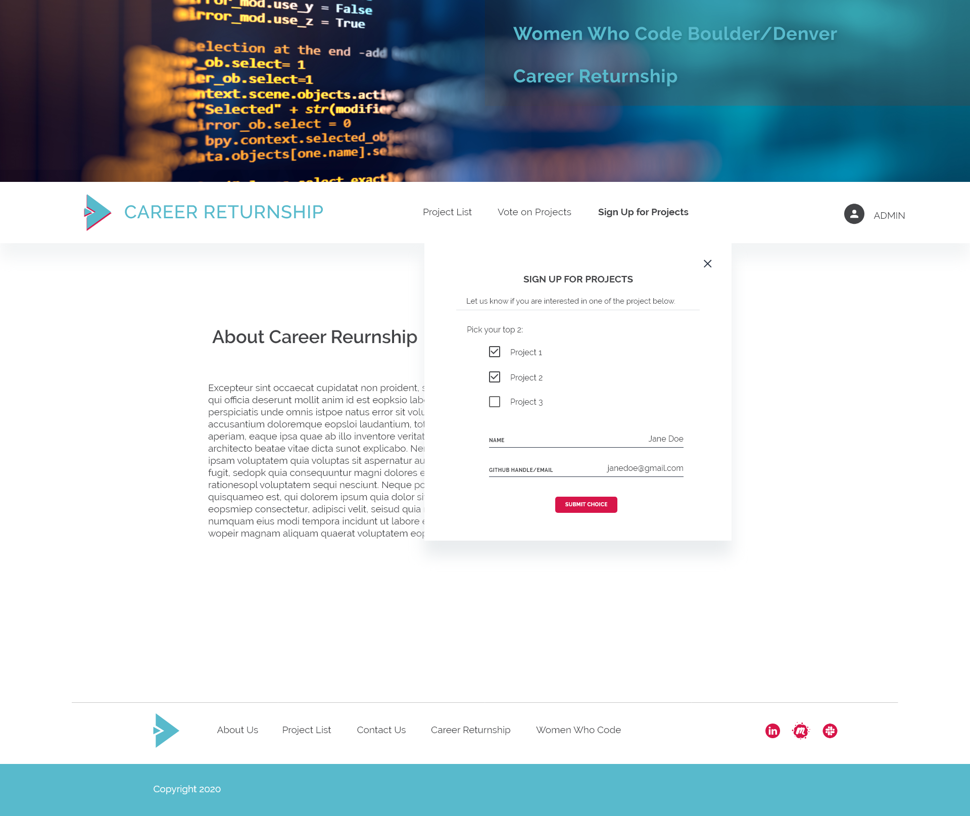
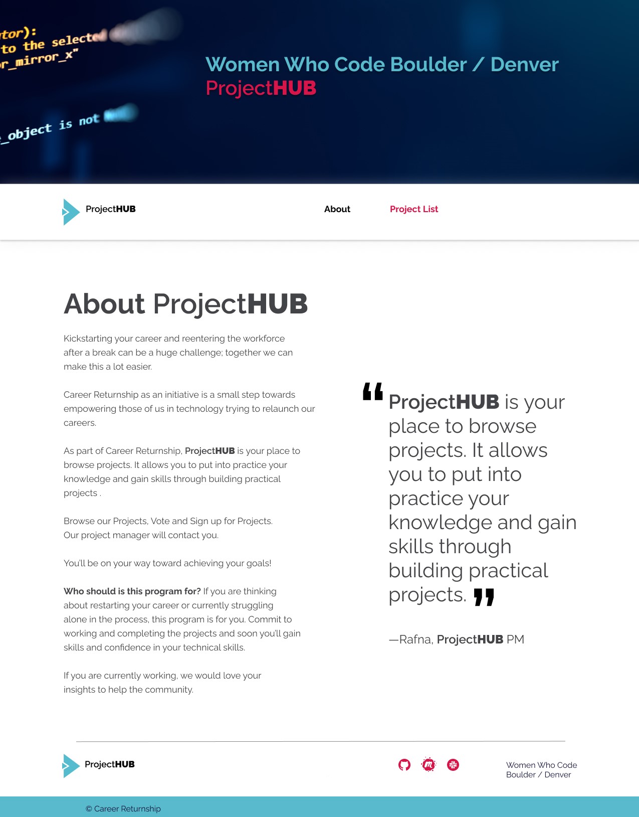
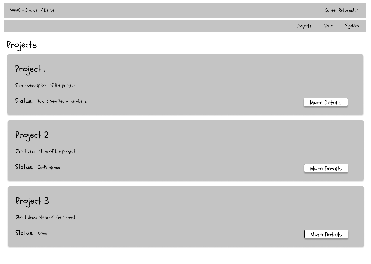
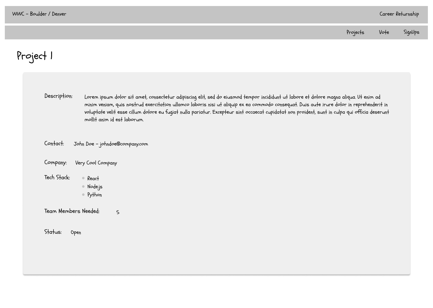
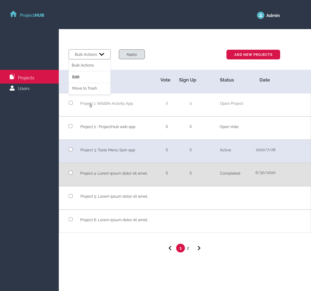
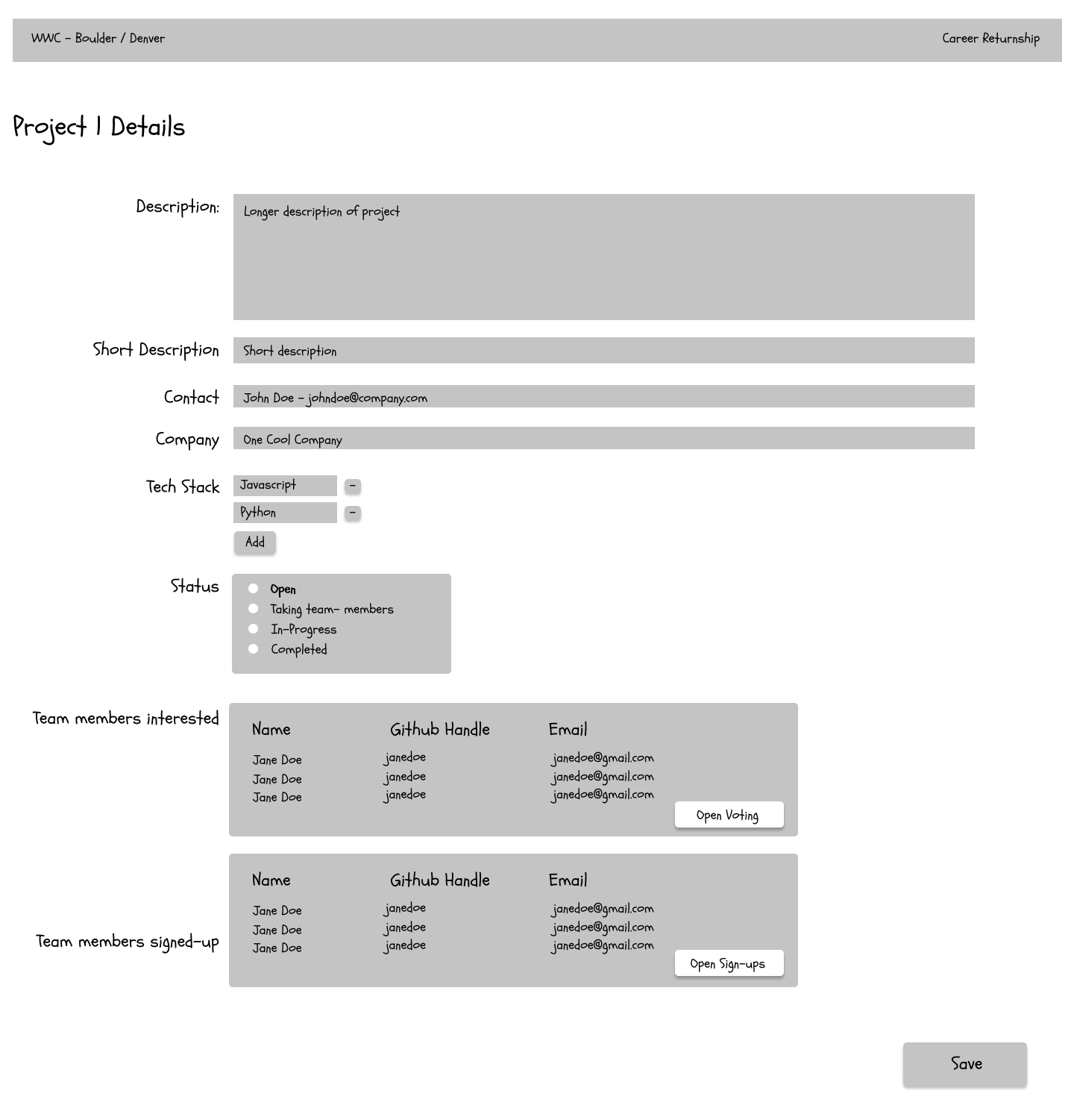
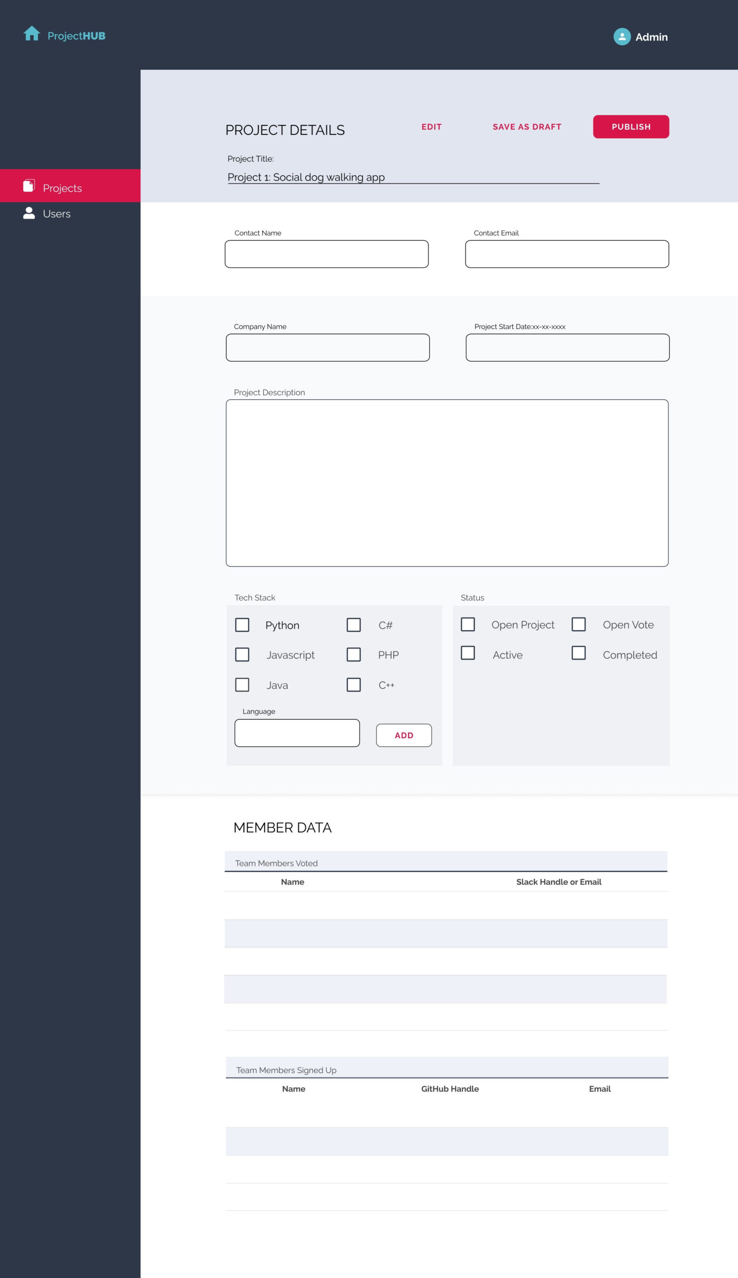
WWC Boulder Colorado

Support for Women who want a Career in Tech

OVERVIEW

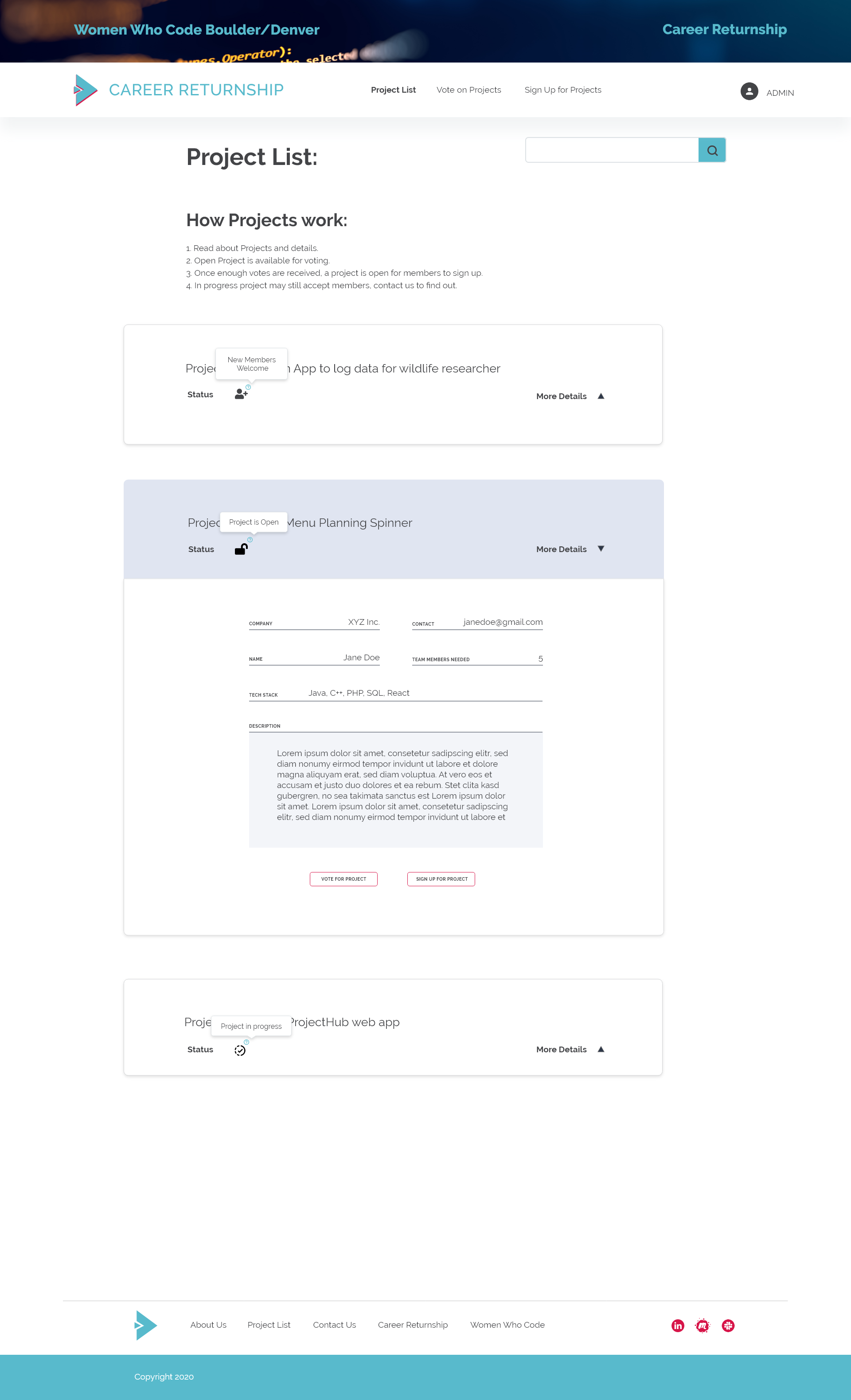
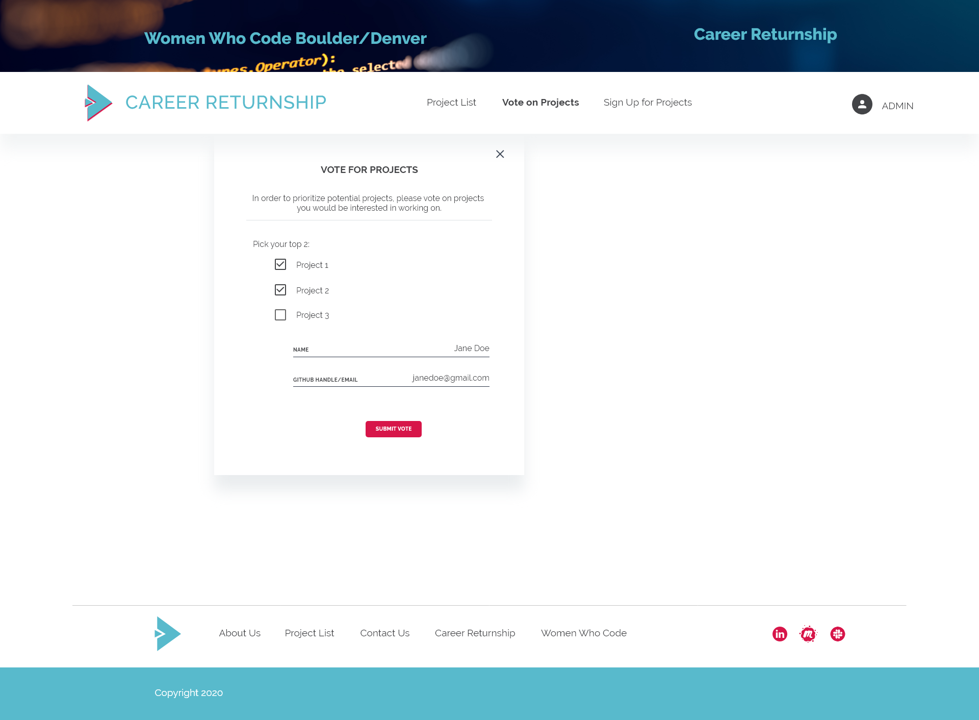
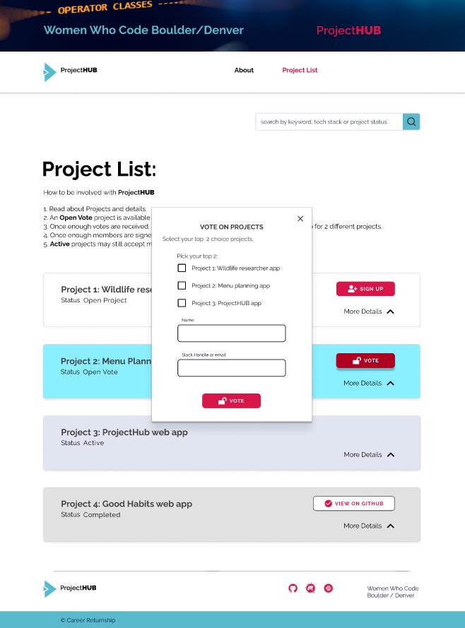
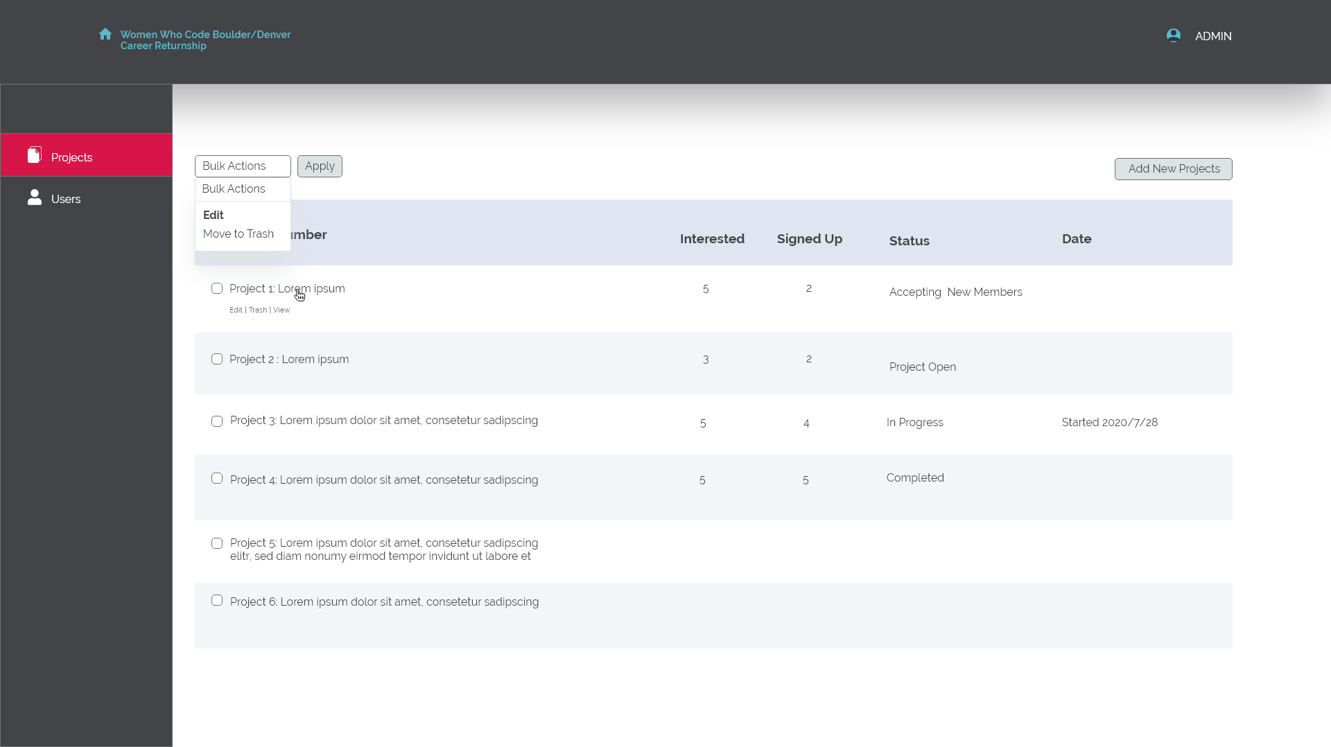
On this project, I worked with the project manager on designing the back-end admin dashboard and form. I worked with developers and solicited their feedback on my design feasibility. 

CLIENT: WWC Career Returnship Project Manager
ROLE: (UX) Designer
TEAM: PM/Admin, 3 Developers, 1 Designer (me)
SKILLS: User Interviews/ User Testing, Prototyping, Style Guide

PROJECT DURATION: 9 months so far (part-time: we meet once a month, sometimes twice. We are a remote team: Colorado, Texas, and Ukraine. There were months we didn’t meet because the project is being coded or life happens.)

Interactive Prototype with input fields.

Inherited color palettes and logo shape from CAREER RETURNSHIP

Initial Design Decisions and Process

This project began before I joined. I was given the wireframes, colors, and fonts (see pictures). I spent some time translating the wireframe into a design. I discussed the design with the project manager, who will also be an admin for the site. 

These were some design decisions I made:

  • Selected teal color because it is a color associated with coding tools such as Visual Studio Code. Also I chose teal to differentiate ProjectHUB from its sister website, CAREER RETURNSHIP, which has fuschia/hot pink as its primary color.  
  • Since there were many font choices, I stuck with one, Raleway, because compared to Montserrat, it would be slightly easier to read, allowing you to differentiate Il1. Compared to other fonts, it is not as dark/heavy.
  • Since the project started with wireframes, I continued and translated them to a prototype, with inputs from PM/Admin, developers and then tested with users.

From Wireframes to Prototype

Website Design Iterations

About page sketch by developer

About page Design (with inherited font and logo) and text write up (by yours truly)

Revised About based on user testing and interviews

About Page

Based on user interviews and user testing, these changes were implemented.

  • Users expected to see resources, tips, resume help with regard to getting into tech. They associated ProjectHUB with Career Returnship, which provides resources (meetings, workshops, etc). Instead, the ProjectHUB website is about leveraging technical skills, via projects, to gain employment. The name was changed to reflect the purpose of the website. 
  • Removed admin login on homepage. Via a specified URL, the admin can log in to get access to the back end. This way the user does not mistakenly think there is a login option.
  • Simplified navigation. Buttons for voting and signup should be next to projects.
  • Because the About page looked visually boring, I used quotes to visually capture the essence of the About page.
  • Changed logo font color from teal to black to improve accessibility (after design review)

Project list pages by developer

Explored use of color and icons and tooltips. In another version (not shown) is icons with text.

Revised Project List page design. Color was used to draw attention to active and completed projects. Buttons are placed next to project for easy CTA (I arrived at this version after a short questionnaire A/B survey).

Project List Page

  • Removed tooltip because it required unnecessary step of ‘hover over’ to understand the meaning of the icon. 
  • Revised wording for Project List instructions and project status for clarity.

Page wireframe by developer

Sign up modal.

Redesigned sign up modal to fit mobile width (iphone 6,7,8).

Sign Up and Vote Modals

  • Redesigned Sign Up and Vote (see below) modals to fit mobile (iphone 6/7/8 width) but works on desktop as well. 
  • Changed input field type so that focused state can be more accessible.
  • Added project name per user testing input.

Vote page by developer

Vote modal.

Redesigned vote modal to fit mobile width (iphone 6,7,8).

Admin dashboard, wireframe by developer

Admin dashboard, initial version

Admin dashboard, revised.

Admin Dashboard

  • Modeled Admin dashboard on WordPress CMS.
  • Used color as visual separation and to communicate completed and active projects, consistent with the front-end project list.
  • Considered future use of the website: multiple admins, bulk deletes, save as draft.
  • Designed dashboard for easy scanning, added project status, and date as useful information for project manager.

Project details, wireframe by developer

Translated wireframe, layout

Revised form layout after speaking with PM/Admin

Admin Project List Form

  • Separated form into 2 parts: one completed by admin and data collected from the website.
  • Color used as visual separation and communicate information that will appear on website vs. information for admin only. 
  • Considered future use of the website: multiple admins, bulk deletes, addition of tech stack/programming language.
  • Designed form for easy scanning, added project status, and date as useful information for project manager/admin.

Translated desktop designs into mobile, after discussion with developers.

Challenges & Takeaways

  • Finding users to interview: career returnship group is really small/handful. It was not ideal to receive less than 5 people to interview, but it is a good start.
  • Talking to the developer and PM/Admin was really helpful for my design process. Admin’s/PM preference provided helped to select one of two mobile design layouts. I received feedback from the developer on whether the designed column/row in responsive mode made sense and could be coded.

Some takeaways: What I learned

  • Not perfect, but it’s a start: In this COVID time, we are doing our best. I am grateful to be working with Women Who Code developers, PM and volunteer users and that we all learning together.
  • I miss having another designer to roll ideas off with or receive feedback on my design.
  • Why didn’t I do full blown research? Given that this project is small and simple (navigation and content were not complex), I was able to get away with minimal research. This is to say iteration will be forthcoming as we learn more from users. 
  • Not everything users want users will get. After discussing my findings with PM/Admin and developers, a few features will not be implemented: such as view project on GitHub button, labeling of the project as beginner-friendly (this is hard to determine because there is a minimum skill level needed for project completion) 

Next Steps

  • The website is almost ready to go public. After that, I will see if I can get users for post-launch interviews and see where improvements can be made.
Scroll to Top